Social Media

Livefyre Studio Puts The Company’s Focus On User by Gavin Lau

livefyre-studio.jpg
At this point, I should probably stop calling Livefyre a commenting platform.

Actually, the company has been expanding beyond comments for a while. It launched its StreamHub product, which included more social media widgets, back in 2012. And it acquired social media curation startup Storify last year.

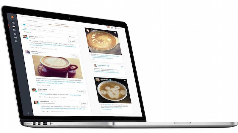
But the company is taking another big step in this direction with the relaunch of its core platform, which it’s now calling Livefyre Studio. The idea, basically, is to allow online publishers (whether they’re news organizations or brand marketers) to gather user generated content from anywhere online, and then to republish it anywhere in turn.

In some ways, it’s similar to what Storify already does, but it sounds like the aim here is to provide that kind of social media curation on a bigger scale, with more automation, and often for more marketing-centric uses. (This could also turn Livefyre into more of a competitor for startups like Chute and Percolate.)

In a quick demo, founder and CEO Jordan Kretchmer showed me how a customer could search for different types of content on Facebook, Twitter, Instagram, and across the web; hand-select the content or set up rules for automated gathering and filtering; then publish it to a customized media wall on their own site, their mobile apps, or in an ad. (The search part, by the way, is powered by Storify — Kretchmer said it’s the first integration of Storify into the main Livefyre platform.)

Livefyre Studio also includes the ability to ask users for the rights to their content, and analytics capabilities to see how these campaigns are actually performing.

The company has actually been testing the platform for months, Kretchmer said, and it went live for all customers last week. For example, it was used to create Sony’s “Greatness Awaits” page highlighting content from the PlayStation 4 community, as well as Unilever’s sustainability initiative Project Sunlight.

It can be useful for news organizations, too — Fox News took advantage of the ability to include this content in custom apps, creating an election map highlighting related tweets and Instagram photos.

But judging from our conversation, as well as Kretchmer’s blog post announcing Livefyre Studio (which does mention comments, if only very briefly), the emphasis seems to be pretty clearly on the marketing side. In fact, Kretchmer told me that in the past year brands have grown from to 0 to 30 percent of Livefyre’s revenue.

And he argued that all the user generated content posted on social media presents a big opportunity for companies to connect with consumers, both on their own sites and elsewhere, but “brands don’t have internal resources for managing this stuff.”

“We have to make it as easy as humanly possible to let brands access all of these great applications,” he added.

Introducing Livefyre Studio from Livefyre on Vimeo.

Facebook Launches Standalone Groups App by Gavin Lau

facebook-groups.png

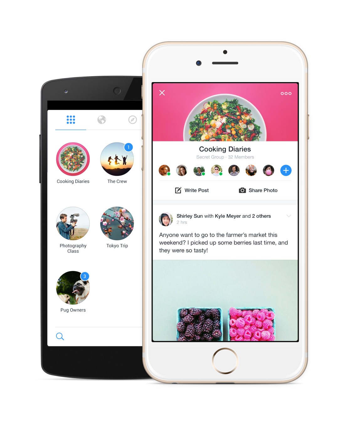
700 million people use Facebook Groups every month, but it’s a second-class experience on mobile, slow and buried in the social network’s main app. So today Facebook is releasing a standalone Groups app with powerful notification controls and a Groups discovery section. You won’t be forced to use it as the Groups feature will remain in the Facebook app, and you won’t be fast-switched to it either.

The Groups app for iOS and Android could be a massive help to admins trying to keep their communities from devolving into chaos, and speed up the consumption experience for everyone from families and friend cliques to study groups and support networks. It’s bright, quick, and could unlock more private sharing outside of the News Feed.
groups-hero

“No one is really doing this out there. We think what we offer is unique”, says the Groups app’s project manager Shirley Sun.

Despite Yahoo and Google fiercely competing to dominate group email lists, there’s a surprising lack of people and rich content-focused social feed groups services, and Facebook is happy to capitalize. Getting more people to organize their personal lives and projects with Groups could also stoke interest in the enterprise “Facebook At Work” product the company is currently piloting. Facebook could end up competing with Slack or Yammer, and this is a stepping stone.

Giving Groups The Spotlight

Mark Zuckerberg actually telegraphed the launch of the standalone Groups app a year when I interviewed him on-stage at an internal Mobile Dev Day at Facebook headquarters. He explained “if you have something like Groups, it’s always going to be kind of second-class in the main Facebook app, or even messaging for that matter. In order to make these things really be able to reach their full potential, I do think over time we’re going to have to create more specific experiences.”

1412581_10152080157154382_2038733334_o

Facebook had seen the need for a first-class mobile chat experience way back in 2011 with the launch of Messenger, but many other popular features were left to languish in the hidden menu of the main app.
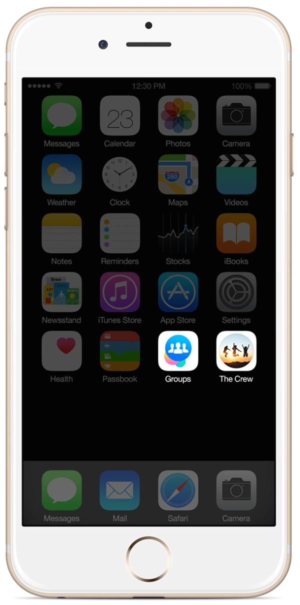
groups-ios-add-to-homescreenGroups has been a Facebook feature all the way since the beginning. Back in the 2005 era, they served more as bumper stickers for your profile that organizational communities. College kids would join the “Unidentified Party Injuries” group to trumpet how “cool” they were for getting bruises while drunk.

But in 2010, Facebook relaunched Groups in its modern incarnation as a way to share to a specific set of people, away from the News Feed. Yet despite some face-lifts, the feature hasn’t gotten much love, especially on mobile since.

In January 2014, Facebook revealed its Creative Labs initiative designed to build single-purpose mobile apps and experiment with new functionality starting with Paper, and stylized standalone home for News Feed.

Then in February, Facebook began work on the Groups app. Sun tells me the Facebook Groups’ team’s idea for a standalone app “has always been on our mind”, and the urge just got stronger as more and more users shifted to mobile. The social network now has over 456 million mobile-only users. It was time for Groups to shine.

Using The Groups App
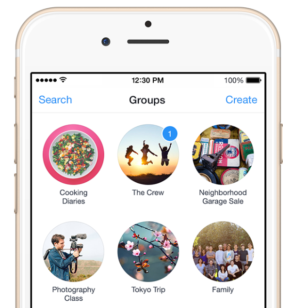
Groups IconsPhilosophically, the standalone app doesn’t change what Groups is about. It just makes it cleaner, quicker to access, and more mobile-friendly.

Once you sign-in with Facebook, all your existing Groups will be laid visually in two-wide grid as little circles displaying their titles, cover photos, and notification badges. They’re ordered by how often you use each Group, so ones with new notifications may be below the fold, which could be a bit tricky if you don’t see the pushes new posts or replies trigger.

Tap into any, and you’ll find a sleek Group feed with a sharp white background, rather than the main app’s gray canvas. A special notifications setting lets you mute one or all your Groups for an hour or until the next morning if you need some peace.

It’s also super easy to create a group. Choose what it’s about such a family, class, or teammates, give it a title, select its public/closed/secret visibility setting, and add some friends. If you choose family or close friends as the type, Facebook intelligently defaults your group to be secret. You can also add a home screen shortcut to your favorite groups for even faster access.
groups-android-discover

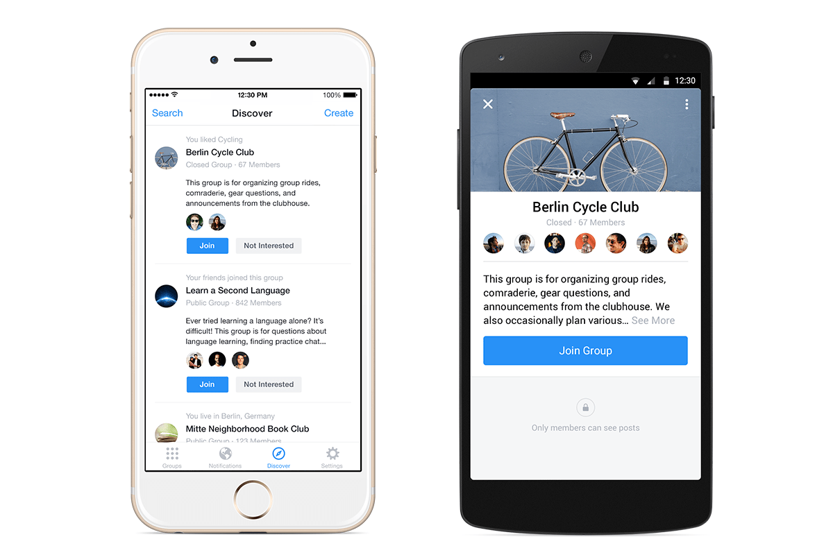
One new feature for mobile is the Groups Discovery section, which will help you find ones to join based on your friends, ones active nearby, or communities related to your interests.
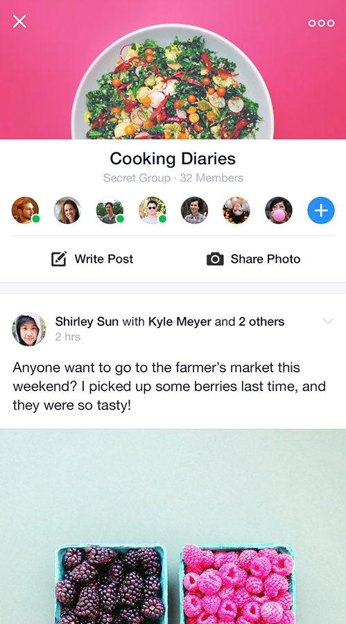
groups-ios-feedTo stoke growth, Facebook will slowly begin showing a promo for the app atop the mobile Groups of the feature’s most active users and admins.

There’s no plan for monetization right now, as Facebook is making plenty of money from the News Feed. It’s beat the street its last nine quarters. Down the line, though, Facebook could generate revenue from a frequent Groups use case: commerce.

The African island nation of Mauritius has over one quarter of its population, 250,000 people, in a single Group that acts like a Craigslist classifieds. The company is already working on a Buy button to let you make purchases without leaving Facebook thanks to a credit card on file. That could potentially be expanded to allow peer-to-peer selling.

Sun concludes that Facebook doesn’t need every Groups user on this new app. “This app is a complementary, optional experience, designed for people who are already power users.” She’ll be satisfied if frequent Groups users get even deeper in the feature, and Groups themselves become more lively and active.

A Space For Micro-Sharing
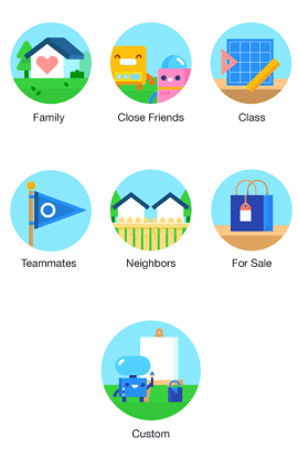
Groups CategoriesNot everything is fit for the News Feed. Groups works great for purpose-driven communication around projects. But there’s a whole realm of intimate sharing that Groups could host. Facebook tried for years to get people to micro-share to specific friend lists, but the controls can be confusing and there’s always a chance you’ll mis-share to everyone.

Zuckerberg’s law states that people share twice as much every year, but that doesn’t mean they’ll necessarily do it on Facebook. Lots of people are sharing to small sets of friends via apps like Snapchat. If Groups is a hit, it could encourage rapid-fire, off-the-cuff sharing between close Groups of friends, creating a third-space to spend time in between the broadcast feed and private messaging.

That could never happen if Groups stayed locked in the nav menu dungeon.

Source: http://techcrunch.com/2014/11/18/facebook-launches-standalone-groups-app/

Flipboard’s New App Gets Personal By Making Topics... by Gavin Lau

img_0243.jpg

Flipboard has been working hard over the last few years to build an app that makes reading stories on mobile and tablet devices as engaging as flipping through a magazine. With the latest version of its app, users will be able to find and discover content that is relevant to their interests, through the introduction of topics they can follow. Already, Flipboard has done a good job of getting — and keeping — readers’ attention. It now has more than 100 million readers who have downloaded the app, and is adding 250,000 more each day. Those readers are flipping about 8 billion pages per month, and that number continues to grow. But the new app is aimed at keeping those users engaged through personalization.

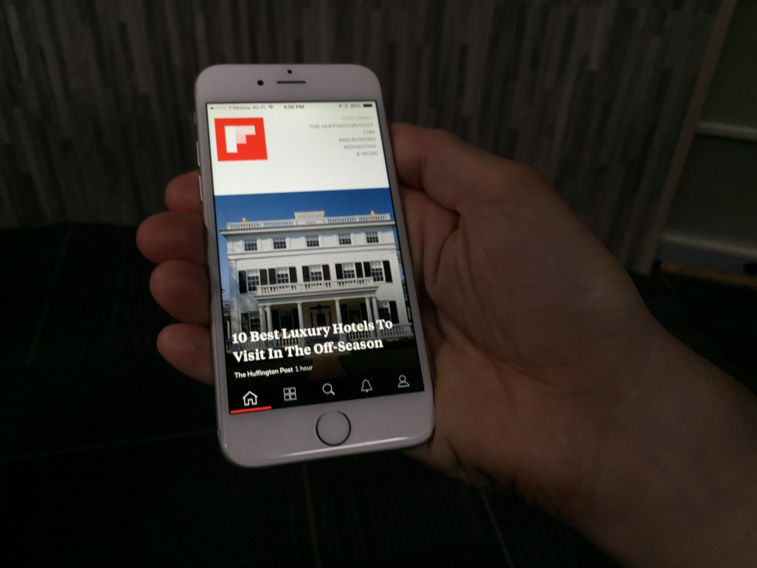
When you first open up Flipboard 3.0, the app guides you through the process of picking a series of topics you will receive updates on. It asks “What are you interested in?” and provides a wide range of suggestions that vary from high-level content based around categories like “Technology” down to more granular topics such as “iPad apps.”

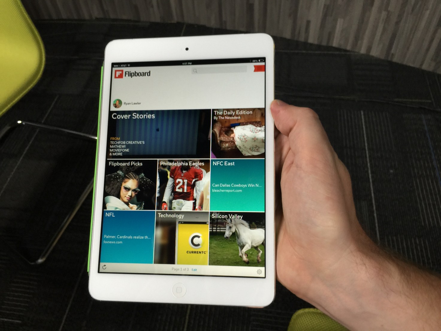
Once you’ve chosen several topics of interest, the app opens up to unveil a front page that features stories from multiple sources you can flip through. Stories are tagged by content provider as well as by topic, allowing users to drill down and see more content related to each. You can also choose to follow stories by source or by topic, which would provide even more content served up to users.

At launch, Flipboard will have more than 30,000 different topics to choose from, so there’s something for everyone. And the ability to easily add topics over time could keep casual Flipboard users keep coming back for more as the app becomes more personalized and relevant to them.

Users can click through to see which topics, people, and accounts they follow and drill down on stories shared there. Or they can search for particular topics. And even if readers are following hundreds of topics, the app will work to showcase the most relevant or interesting topics on any given day, according to Flipboard co-founder and CEO Mike McCue.

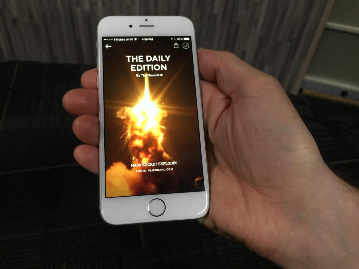
But it’s not all going to be algorithmically programmed. In addition to its topics, the app is also adding a “Daily Edition” of content that has been selected by Flipboard editors. It will be released every day at 7:00 am and will feature all the biggest news from the previous day, as well as a daily photo and “parting GIF” for readers.

IMG_0249

Moving Beyond Reader Curation

For Flipboard, the move to a topic-following model is a departure from its previous personalization efforts. Last year, the company released a big app update that enabled users to create and subscribe to virtual magazines based on their own interests. By doing so, they could curate stories from multiple different sources and present it in a unified fashion. Readers, meanwhile, benefitted by being able to subscribe to magazines created by other like-minded users to discover content they might not have seen otherwise.

Magazines have been incredibly popular on Flipboard: The company says there have been more than 10 million of them created and curated by readers since launch. They can range from having just a few followers to hundreds and thousands of followers — and the top magazines have generated tens of millions of page flips from readers.

That feature also added a new potential revenue stream by enabling brands and retailers to create shoppable magazines and catalogs of products for sale. That’s on top of advertising CPMs that are closer to print publications than digital properties.

That said, Flipboard’s magazine model wasn’t perfect. After all, it relies on readers to keep updating their magazines over time in order to keep providing fresh content to others. Furthermore, each magazine reflects the interests of the creator or creators and may not be exactly what a reader is looking for.

IMG_0247

Zite Acquisition Bears Fruit

The update is designed to improve upon the current experience with a more personalized feed, which users create by following different topics of interest to them. That ensures readers will be kept up to date on the news that’s important to them, without having to rely on another reader to curate a magazine for them.

McCue says the new version blends people-powered curation with algorithmic curation. For that, the app builds on its magazine creation tools and adds features from a couple of acquisitions Flipboard made over the last few years.

The first was its Cover Stories feature, which came about with help from technology it acquired as part of its purchase of Ellerdale several years ago. That gave Flipboard the ability to structure and display content more like a magazine.

It’s the more recent acquisition of Zite which helps to power the app’s new topic-centric following model, however. Zite was acquired from CNN earlier this year, and ever since the combined engineering teams have been working on ways to make Flipboard more personalized and more engaging.

It’s Zite’s technology that is being used to identify and categorize the topics that users can subscribe to. It can do that without its readers building magazines, which opens up a whole lot of new topics and content for readers to discover.

But that’s the whole point. Finding more relevant content is key to Flipboard’s business model, after all.

The more readers flip and the more engaged they are in its magazine-like experience, the more ads they see. The more ads they see, the more money Flipboard makes. And considering that Flipboard has raised more than $160 million since being founded, it’ll need a lot of flips to justify that funding. The good news is, whatever it’s done so far seems to be working.

IMG_0252


Source: http://techcrunch.com/2014/10/29/flipboard-3-0/

Cloth Is Where Instagram And Your Closet Collide by Gavin Lau

screenshot-2014-10-29-10-45-01.png

http://vimeo.com/108715739  

Fashion and social networking belong together, but so far no one has found the perfect balance between user-generated content and a focus on edgy fashion. That’s where Cloth comes in.

It’s a new app, launched today, that lets users share their favorite outfits in an Instagram-like feed, letting them get feedback from friends (with likes and chat) and saving their favorite outfits to remember later.

Cloth has been in beta for two years now, and today launches into public availability on the App Store. It was founded by Seth Porges, who has been a longtime journalist for organizations like Maxim magazine, Popular Mechanics, Bloomberg News and Men’s Health.

With Cloth, however, Porges shifts to a more entrepreneurial focus, looking to help people record their own best looks and share them with others.

“The goal has always been to make getting dressed easier and more fun,” said Porges. “We wanted to make an app that enhances how people are already using their phones and fashion together, without forcing them into unnatural actions that they aren’t already doing.”

Cloth not only allows you to build out a closet through photos, shared in a stream, but it also allows you to tag them so that others can search for inspiration based on specific guidelines. Plus, Cloth includes weather notifications to help you get dressed each day.

The company has raised a small undisclosed amount from a group of unnamed angel investors thus far.

Source: http://techcrunch.com/2014/10/29/cloth-is-where-instagram-and-your-closet-collide/


Feels Like Driving In The Future by Gavin Lau

Screen-Shot-2014-09-13-at-1.58.48-am.png

https://www.youtube.com/watch?v=pKL4PJICS40 We're based in the Mission District of San Francisco. Navdy was founded by entrepreneur Doug Simpson and serial inventor Karl Guttag, and is supported by a highly accomplished veteran team. In 2013 Navdy went through the acclaimed Highway 1 Incubator program and continues to work closely with Highway 1’s parent, PCH International, whose world class supply chain and manufacturing capabilities are used by companies such as Apple, Beats, and Google.

Share Little Photos That Disappear In 24 Hours by Gavin Lau

screen-shot-2014-09-11-at-1-43-51-pm.png

Digg, Milk, and Revision3 founder Kevin Rose recently left Google Ventures to start a new mobile development house called North, and now we have some details on the firm’s first app, Tiiny, which will launch soon. The basic idea is that Tiiny lets you share thumbnail-sized photos and animated GIFs to a grid of pics on your friends’ phones, and they disappear 24 hours later. Rather than making you scroll through full-width photos like Instagram, Tiiny lets you get a constantly-updated look at what lots of your friends are up to in a single glance.
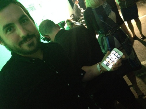
Rose told TechCrunch founder Michael Arrington that the app is currently going through the iOS App Store approval process and should launch very soon. Rose’s team said he’s not ready to talk more about the app just yet, but we’ll have more details on TechCrunch when it’s time.

I did get a quick look at the app yesterday, though, and it’s slick. As you can sort of make out from the photo below, the top of the screen features a 3-wide by 4-tall grid of photos and animated GIFS, with a button to capture and share more at the bottom. Seeing all the moving images on the same screen made the app feel vibrant and alive, which could make it addictive to check compared to more static apps like Instagram or even Vine, which only shows one video at a time. Rather than a replacement or direct competitor to other more public broadcast and direct messaging photo apps, Tiiny seems like it could fit in as a complement.

There’s also supposedly some more functionality but we’ll have to wait until it’s out for that.

photo__2_-2

North, which we profiled last month, has a peculiar strategy. Rather than languish on building one app, North is trying to use a small team of about 3 people to launch a new mobile app every three months. This scheme lets North quickly throw apps against the wall and see what’s sticky for users. With building social apps being likened to capturing “lightning in a bottle”, this diversified approach means North won’t spend a year building something no one wants. If Tiiny is a flop, the team will just move on to the next app.

Former Googlers Launch Osmo, A Gaming Device That Combines Real-World Play With The iPad by Gavin Lau

osmo.jpg

A number of companies have attempted to combine physical objects and the iPad in an effort to create new kinds of children’s games, whether that’s Crayola with their DigiTools coloring pens or games that teach toddlers their shapes, like Tiggly. Today, another digital toymaker, Tangible Play, is entering this space with the launch of a series of high-quality games designed for children ages 6 to 12, including puzzles, word games, and other forms of creative play.

In development for over a year, we first spotted Tangible Play demonstrating its games at a previous TechCrunch Disrupt Startup Alley.

The company was founded by ex-Googlers, including Pramod Sharma, who had earlier seen the intersection of physical and digital when he helped build Google’s book-scanning machine, and Jérôme Scholler, who had worked on Chrome for Android.

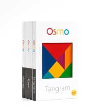
box-3pack-osmoBoth men are also dads, and like most parents, they have mixed feelings about the way today’s tablet computers engage kids’ attention. On the one hand, technologists generally like to see their kids embracing digital tools at young ages.

But, says Sharma, “[my daughter] could literally spend hours just looking at a screen, and doing nothing else. And as a parent, this is obviously concerning,” he says. That led the founders to create Osmo, the company’s first product built to combine social and creative play with the highly engaging tablet their kids were addicted to.

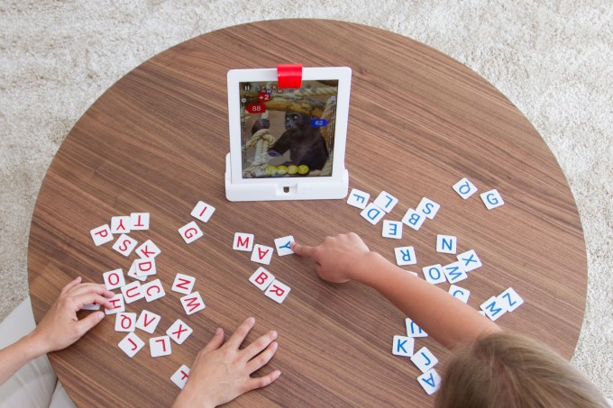
The games center around a technology which they refer to as “Reflective Artificial Intelligence.” What that means is that the Osmo gaming kit includes a uniquely designed reflective camera that snaps onto the top of the iPad, allowing the app to “see” the shapes and objects placed in front of the tablet on the tablet or other flat surface.

The game kit also includes an iPad stand and two physical games, their app counterparts, as well as third app that’s Osmo’s most recent addition.

IMG_0105

While the best way to experience Osmo is to try it for yourself, the general gist of the experience involves playing a game in front of the iPad, following software prompts along the way which guide the gameplay.

In the case of “Words,” children try to quickly guess the word by sliding letter tiles in front of the tablet, while in “Tangram” kids use colorful wooden pieces to try to reproduce the image on the screen by placing shapes together. A third title, “Newton,” lets you engage in more creative play by placing any object in front the iPad – glasses, a pen, your hands, etc. – to turn them into structures inside a game involving bouncing balls and targets.

Though my daughter is only four, and below the target age range for these apps, with some guidance we were able to play some of the Osmo games together. It was easy to see how these games could make the iPad a more social activity - something that’s more like the modern-day equivalent to what was once the family board game night at home.

http://youtu.be/CbwIJMz9PAQ

That being said, the test versions I was able to try (admittedly a few weeks behind the versions of the apps launching today) did have some kinks. I found, for example, that the shapes game “Tangram” would sometimes not see the pieces correctly, lighting up to show a match, then dimming again for no apparent reason, then lighting up again, which was confusing.

The sounds effects and music also need work, as they didn’t seem quite as kid-friendly and engaging as they could be. (They actually sound better in the video above, than in person). But overall, the games work as advertised, provided you have good lighting and a flat surface to play them upon. And Sharma says that now the goal is to make Osmo work on any surface, including floors and tables alike.

osmo2

The company has been piloting the games in over one hundred schools, many near their home base of Palo Alto. From these early tests, the founders came to better understand the potential for Osmo from an educator’s perspective, explaining that their group play nature could help with a child’s social and emotional learning, while other games taught different concepts, like spatial intelligence and creative thinking.

Crowdfunding Launch

Today, Tangible Play is launching its crowdfunding campaign which will allow it to assemble a core group of early adopters who the team hopes will help to evangelize the product and help Osmo gain traction. Though the gaming kit will eventually retail for $99, crowdfunding backers will be able to get it for a discount at $49, with some limited availability. The goal is to raise $50,000 to help with start-up and manufacturing costs.

However, the company doesn’t really need the crowdfunding in order to get the device to manufacturing, as they’ve previously raised an undisclosed round of seed funding from K-9 Ventures last year.

You can join the new crowdfunding campaign or learn more here: www.playosmo.com.

Source: http://techcrunch.com/2014/05/22/former-googlers-launch-osmo-a-gaming-device-that-combines-real-world-play-with-the-ipad/

Pinterest Plans “Choose Your Own Adventure” Product by Gavin Lau

youre-invited-1.jpg

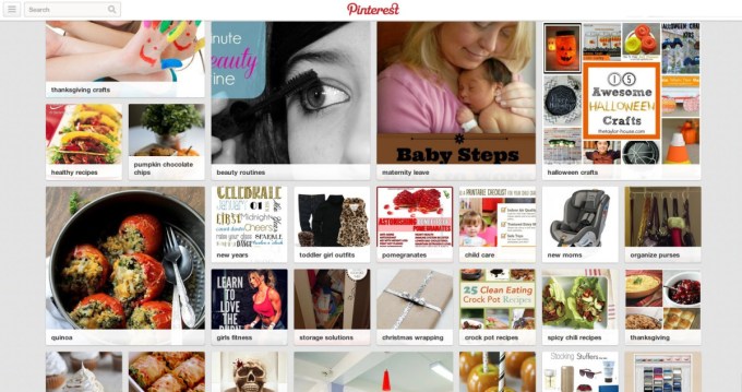
A more personalized way to pin may be on the way as Pinterest has announced a big press event in San Francisco on April 24th with the teaser image above. We’ve confirmed with the company that this will be a product announcement and CEO Ben Silbermann will speak. So what will Pinterest unveil? The startup has written that this year it’s focused on helping people discover pins related to their interests. In January it launched a preview of a new personalized homepage that learns from what people have browsed and pinned in the past. This “Explore Interests” page then presents pins related to their tastes, and uses a mosaic of different-sized tiles to highlight certain items instead of Pinterest’s iconically uniform mason grid.

A full launch of Explore Interests would match the “choose your own adventure” theme. It would also mesh with what Pinterest head of engineering Jon Jenkins told me last year was on the roadmap for 2014. At the time, he said “Pinterest isn’t fundamentally about connecting people to other people. It’s about connecting people to interests…We try to identify interests through collaborative filtering, associative rule mining, natural language processing to provide discovery. I can pin five shirts I like and Pinterest derives my interest in fashion.”

pinterest-personalized2


A personalized home page could use all these signals to provide a relevancy-filtered feed, much like Facebook does. That could make Pinterest a more relaxing place to visit and browse. Instead of having to hunt through topic-specific boards or know what you’re looking for with search, Pinterest will bring what you like straight to your digital doorstep. That could make it more addictive for hardcore users and more accessible to rookies. As the majority of Pinterest’s traffic now comes from mobile, I’d expect this personalization to show up on the small screen too, not just the desktop.

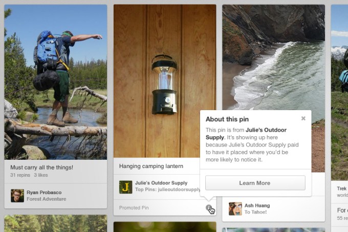
We’ll also be on the lookout to see if Pinterest announces any more plans on the monetization front. Pinterest raised a jaw-dropping $225 million at a $3.8 billion valuation in October, and everyone wants to know how it will make good on that investment. After months of testing, Pinterest plans to formally launch its “Promoted Pins” ads this quarter,according to the Wall Street Journal. These ads look like organic posts from users, but brands pay to make them appear in search results and category pages related to specific topics.AdAge says Pinterest is looking to charge a pricey $30 to $40 per thousand impressions (CPM), and has been asking for $1 million to $2 million commitments from advertisers.

2013100801

In my opinion, this kind of keyword-based advertising could be a very lucrative for Pinterest, because its visitors often come with a great deal of purchase intent. Promoted Pins won’t be scattershot demand generation, which has historically been Facebook’s wheelhouse. Instead, these will be demand-fulfillment ads, similar to Google’s bread and butter of search keyword ads.

And they could rake in cash for Pinterest by helping people make big purchase decisions. Dream vacations, ideal homes, children’s nurseries — there are the expensive things people pin. People know they want to vacation on St. John, buy a crib, or rent a lake house, but don’t know exactly where to spend their money. A beautified Pinterest ad could make the difference between which resort you visit, what home you lease, or where you shop for all your baby gear. With big cart sizes, e-commerce advertisers could quickly earn a return on their investment. eMarketer now gauges Pinterest at 40 million monthly users in the U.S., an audience big enough to drive serious ad revenue.

We’ll be there at Pinterest headquarters for the event on April 24 at 6pm PDT, and you can expect live updates from TechCrunch. Until now, Pinterest has acted almost like a clearinghouse for subscribing to magazines about your specific interests. But soon, it could employ big data so rather than having to subscribe to what you like, that content (and related ads) will come find you.

Source: http://techcrunch.com/2014/04/15/pinterest-event

Photo-Sharing App Frontback Comes To Android by Gavin Lau

frontback-android.png

Frontback just released the Android version of its popular photo-sharing app. Previously, the app was only available on iOS. But even with just the iPhone app, the app was downloaded one million times over the past eight months. With the new Android release, the company can certainly expect many new users. Frontback started as a photo-taking app to capture fleeting moments. A Frontback post is a digital collage of what’s in front of you, and your face as it happens.

I’ve been playing with the Android app for the last few weeks, and it’s everything you would expect. It looks and acts exactly like the iOS app, but on Android.

At the same time, it was re-skinned to look more like an Android app. Buttons and menus follow the general Android guidelines. This way, Frontback makes you think it has always been an Android app.

There is one additional feature compared to the iOS app — offline mode. You can now take a Frontback without connectivity and send it. The app will keep the photo and push it to Frontback’s server the next time you’re online. This feature will come in the next iOS update.

“In our case, due to full screen images, memory’s issues are indeed amplified, especially considering that Frontback provides on top of that a camera functionality,” Frontback lead Android developer Giovanni Vatieri wrote in an email. “The biggest challenge for the camera part is to reach the highest photo quality possible considering the different devices’ capabilities and the memory available at the moment the user access the camera.”

Moreover, Frontback’s user interface is very different from other photo-sharing apps. When you open the app, you just see two square-ish photos on top of each other (a Frontback post), filling up the entire screen of your phone. Yet, some Android phones have different aspect ratios, screen resolutions and more. The company had to work around these constraints.

The company also worked a lot on the iOS app before releasing the Android app. When your app is available on multiple platforms, you have to develop every single feature multiple times to reach feature parity. That’s why the company wanted to improve the iPhone app before releasing the Android app.

Co-founder and CEO Frédéric della Faille also shared some numbers. While the app recently reached one million downloads, its user base has doubled in the past two months. Compared to January 2014, the number of uploaded photos has tripled. In other words, active users are becoming more active, or the ratio between active users and total users is increasing.

These are not hard numbers, so it’s hard to claim for sure that the company is doing well. But there is one thing for sure, the Android app is a much-needed addition in order to boost the company’s growth.

Frontback Meetup


Source: http://techcrunch.com/2014/04/16/photo-sharing-app-frontback-comes-to-android

Colorbay is a new way of looking at photo-sharing platforms by Gavin Lau

colorbay-main.jpg

Colorbay is a beautiful iOS app that lets you browse images from popular photo-sharing sites like Instagram, 500px, and Flickr. If you are a longtime user of these services, Colorbay is also a time capsule that lets you rediscover old favorites. For example, Instagram only shows the last 300 photos you’ve liked because the service wants to make sure it “runs smoothly as the app becomes available to a growing number of people.”

That might seem like a lot, but over the past three years, I’ve liked way more than 300 photos on Instagram, including pics of my friends’ children as they grow up and images from design-related accounts that I save for inspiration.

I have even more old favorites on Flickr because I joined in 2004 and was an avid user. Back before Facebook became widespread, Flickr was my favorite site because there tons of very active groups for things ranging from Japanese Rement miniatures to vintage clothing.

But I’ve stopped visiting Flickr as often as I used to, partly because most of the people I met on the site have migrated to other social networks. I also disliked last year’s major redesign and Flickr’s Favorites page was never easy to navigate in the first place.

end on Pinterest or Evernote to catalog most of my favorite images, but Colorbay’s “My Likes” stream is a welcome trip down memory lane. I found photos I haven’t looked at in almost five years, but still enjoy. It’s also a fun way to browse my own old snapshots.

Colorbay, which is also available for iPads, displays photos in a mosaic-style stream that automatically plays unless you pause it. It currently allows you to browse your timelines and popular photos from 500px, Flickr, Instagram, Pixter, and App.net. Colorbay’s cool “Throwback” feature automatically delivers a random mix of photos from all services, while “Lomography” delivers film (or film-like) photos with that tag. You can also search your own tags.

Even if you don’t like to wallow in nostalgia as much as I do, Colorbay is also a fantastic photo discovery tool and a great piece of eye candy.


Source: http://techcrunch.com/2014/04/07/colorbay-is-a-new-way-of-looking-at-instagram-flickr-and-other-photo-sharing-platforms

Android and iOS users spend 32%... by Gavin Lau

flurry_time_spent_android_ios.jpg

Android and iOS users in the US spend an average of 2 hours and 42 minutes every day using apps on smartphones and tablets (up just four minutes compared to last year). Of that, 86 percent (or 2 hours and 19 minutes) is spent inside apps, while the remaining 14 percent (or 22 minutes, down 6 percentage points compared to last year) is spent on the mobile Web using a browser. These latest figures come from mobile firm Flurry, which provides analytics and ad tools that developers integrate into their apps. The company collected data between January 2014 and March 2014 and concluded that “apps, which were considered a mere fad a few years ago, are completely dominating mobile” while the browser “has become a single application swimming in a sea of apps.”

Here are the results in graph form:

Just like last year, games took first place with 32 percent of time spent. Social and messaging applications increased their share from 24 percent to 28 percent, entertainment and utility applications maintained their positions at 8 percent each, while productivity apps saw their share double from 2 percent to 4 percent.

It’s worth underlining that Facebook’s share dipped a bit from 18 percent to 17 percent. Nevertheless, Facebook still has the lion’s share of time spent in the US, and was able to maintain its position with the help of Instagram. Flurry argues that position will become even more cemented, if not increased, once the acquisition of WhatsApp closes.

This year, Flurry broke out YouTube separately, which shows us it owns a whopping 50 percent of the entertainment category. We’ll be watching closely to see if it manages to grow its 4 percent share of time spent.

“It is still too early to predict the trajectory apps will take in 2014,” Flurry admits. “But one thing is clear – apps have won and the mobile browser is taking a back seat.” Unless this trend reverses, we can expect many more acquisitions from tech companies the size of Facebook and Google.


Source: http://tnw.to/q3Jet

Digital consumers raise new expectations by Gavin Lau

apigee-mobile-shopping-survey.jpg

The consumer retail experience is being disrupted thanks to the growth of technology and social media. These have changed the way consumers look for product information, find reviews, and shop for their clothes, gadgets, amenities, and food, all from their phone, tablet, or laptop. It is the omnichannel era, and the consumer is driving changes across the entire retail industry. Join retail leaders at  Omnichannel 2014 to learn how to better connect with the new consumer from the retailers and suppliers who are successfully doing it today.

We can point to three distinctive disruptions that are all having a major impact on how retailers and suppliers can and should connect with their customers.

1. Shoppers expect the same experience with your brand

When shoppers walk into The Gap or Best Buy, they want to see the same brand, look, and colors on Gap.com and BestBuy.com as well as on mobile sites or apps. Consumers expect a more detailed level of product information on the website than they find in the store.

This means retailers and consumers need to focus on providing as much product information as possible. They need to make content marketing efforts more about being helpful than touting specs and features. And they need to make sure they’re listening to customer feedback and testimonials and responding whenever possible.

2. Social media makes sharing of experiences easy

Thanks to smartphones and social media, everyone’s a critic, journalist, and publisher. If you go into a restaurant and have a good or bad experience with the staff or food, you can take a photo and share it and a review with your friends on Twitter and Facebook.

Nowadays, people are sharing their experiences, good or bad, about restaurants, stores, products, websites, and even government agencies and highway traffic. Many of their friends will then help spread the word by sharing those messages. So if something bad happens at your store or with your product, you’d better count on it appearing on social media.

The moral is: Customer service and quality need to be top-notch. That may only earn you a few kudos on social media, but a failure to provide those will absolutely be called out and magnified.

3. Shoppers can use mobile devices to check availability and pricing

Apps like Barcode Scanner, RedLaser, and Shop Savvy enable people to use their smartphone to scan a product barcodes, QR codes, or other systems to check the price and local availability of a particular product. Bookstore visitors can even use Amazon’s smartphone app to scan a book and order it via the website (with free shipping for those with Amazon Prime). This practice is known as “showrooming,” and some stores are embracing it while others fear it.

Some stores are using proprietary barcodes that standard devices can’t scan. As a result, many retailers are missing out on further opportunities to use this functionality as a way to improve shoppers’ experience, to give them something they can’t get at their competitors.

Stores like Burberry and Sephora are providing upscale and personalized shopping experiences. Lowe’s holds educational sessions both for adults and kids. They’re providing a valuable service or experience the other stores can’t. As a result, they don’t worry about showrooming.

New technology has changed shoppers’ expectations for the things they buy. Retailers who want to survive these disruptions need to embrace and use this new technology, rather than run from it and wait for it to go away. It’s not going anywhere, and it’s only going to get bigger.


Source: http://venturebeat.com/2014/03/14/digital-consumers-raise-new-expectations

Apple CarPlay hands-on by Gavin Lau

Screen-Shot-2014-03-10-at-23.13.40.png

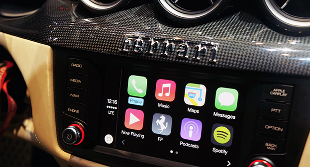
Apple's in-car infotainment system has been a long time coming. After it was announced at the company's annual WWDC conference in June last year, "iOS in the Car" flew under the radar, only to undergo a rebrand and launch publicly yesterday under a new moniker: CarPlay. Sharing part of its name with the company's AirPlay media-streaming protocol, CarPlay combines all of the iPhone's most important features and mirrors them inside the car, allowing car owners to call, text, navigate and listen to music (and more) using touch- or Siri-based voice inputs. The new in-car interface is compatible with new Ferrari, Mercedes and Volvo models unveiled at the Geneva Auto Show, and it's there that we got the chance to test Apple's automotive assistant inside a suitably equipped Ferrari FF coupe. Will CarPlay force you to buy an iPhone to go with your car (or vice versa)? Not really -- the Ferrari we tried actually deployed Apple's dash system alongside its own, while Mercedes-Benz and Volvo (two of Apple's other partners) have said they'll continue todevelop Android and MirrorLink solutions for their new models. Compatible with the iPhone 5 and up, CarPlay is "loaded" into the Ferrari's built-in navigation system by way of a Lightning adapter located underneath the armrest. Wireless connections are coming, at least from Volvo, but our test was limited to traditional cables. Once it's connected, Ferrari will continue to utilize its own infotainment system, but users can load CarPlay by hitting a dedicated dashboard button, allowing all touch and voice inputs to be diverted to your iPhone. This loads the CarPlay dashboard, which features a familiar array of icons and services you'll recognize from your iPhone. From here, it's a case of using the touchscreen or calling upon Siri to load each of the services -- the latter of which can be summoned with the Siri Eyes Free button located on the reverse of the steering wheel.

The first thing we noticed is how speedy everything is. Apps load quickly, and Siri's contextual algorithms hastily recognized our voice commands and responded appropriately. Apple has also implemented safety features to ensure services do not draw your attention away from the road and push forward its "hands-free" theme. For example, when we sent or received a message from a contact, Siri would only read the message back to us and we never once got the chance to see its contents. An Apple representative was able to talk us through each CarPlay feature, so do make sure you check out our in-depth hands-on video above to get a better idea of what Apple and its car maker buddies are aiming for.


Source: http://engt.co/1gOId5x

Smartwatch Apple or Google needs to make by Gavin Lau

Screen-Shot-2014-03-08-at-0.45.50.png

Why can't great smartwatches look like normal watches? Smartwatches, for the most part, can be divided into two categories: vague approximations of the future like the Pebble, Gear, and Gear Fit, or conventionally styled watches from companies like Citizen and Cookoo that offer far less functionality. While it's true the Pebble Steel is making inroads in the aesthetic department, its blocky construction and oversized buttons aren't likely to appeal to the masses.

Gábor Balogh is a freelance designer from Hungary who, like many of us, wants an attractive, watch-like watch that just happens to be smart. The difference between Balogh and the rest of us is he went ahead and designed an interface he believes could enable regular watch designs to include a full bevy of smart features.

After posting his concept for a smartwatch on Behance, Balogh took some time to talk through his interface ideas withThe Verge. The actual watch pictured in the mockups is almost incidental, as the concept simply takes the Swedish watchmaker Triwa's Havana timepiece (with the company's permission) and replaces its face with a circular display. This proposal is about interface paradigms, not product design. "In this concept the UI does not have a predefined style," says Balogh, "but it would match the housing. Only the navigational patterns have to be taken into consideration."

Although the interface itself will be down to watch and phone companies to decide, Balogh offers up some simple but polished ideas that go very well with Triwa's design. Pairing your smartphone to its watch will make the appropriate app icons appear on the display, with notifications, maps, and music information streamed from the device itself. When you don't want it to be a smartwatch, it mostly looks and behaves like a regular watch.

"I LIKE PRODUCTS WITH DISCREET TECHNOLOGY."

02

"I like products with discreet technology," explains Balogh, "when they serve me, my real needs, and make my life easier rather than simply changing my days." He calls out the Nest thermostat and Apple's Airport Express as prime examples of technology being applied discretely without obscuring functionality. "They're just ticking away in the background, making your life easier."

In an attempt to avoid obfuscation, Balogh's concept doesn't utilize a touchscreen or voice control. Instead, the interface uses the buttons and bezel found on most watches. The bezel is key to this interface. It can rotate to, for example, scroll through a long message or switch functions in an app, or be clicked to make a selection. The rotation element doesn't necessarily need to be physical — Balogh says he could imagine a more classical watch going with a physical dial, or a sporty design opting for an iPod-esque click wheel.

Using the bezel for controlling apps and other smartphone-related tasks frees up the three side-mounted buttons to control "native" functions like time, date, and alarms, as well as switching between modes. This clear separation of native and app functions should make the interface easily accessible to users familiar with how a regular watch works, while the lack of a touchscreen will stop the display from picking up smudges and grime from your fingers, and also stop your fingers from obscuring the display. "The size of the watch is a very limiting factor, so we don't have to make it very smart. I see the watch as a piece of jewelry, and wanted to add an interface that would be familiar on a classic watch."

Of course, Balogh is a designer, not an engineer, and there are technological issues that will need to be overcome before we can hope to wear something like his concept on our wrists. Circular screens, although not impossible, are a rarity, and squeezing a battery and the necessary circuitry into the tiny space that usually contains mechanical watchworks would be difficult. That said, the guts of a Pebble are actually fairly small, and larger watches may be able to contain them.

As a busy freelance designer, it's unlikely Balogh will be able to muster the time or funds to assemble a team and make his concept a reality. But as technology advances it's easy to see a future where tech giants like Samsung rein in their "futuristic" designs and attempt to take on the Breitlings and Tag Hauers of the world with something like Balogh's idea.

Source: http://vrge.co/1lENsu8

Apple CarPlay by Gavin Lau

Screen-Shot-2014-03-04-at-0.50.45.png

Apple CarPlay Apple’s CarPlay is close to being available in the wild via partnerships with a handful of car manufacturers, and Volvo is already showing off what that will look like in practice. The car maker just posted a video to their YouTube account that provides a glimpse at how the system works.

CarPlay will work with a variety of different kinds of infotainment systems, including those with touchscreens, as displayed in the video, and those that use physical controls. Volvo’s integration also allows them to control features and services using steering wheel-mounted controls, and the first vehicle to sport the interface will be the XC90 SCUV, which is coming to market later this year.

Volvo offers up some interesting technical tidbits about how CarPlay works, too. The connection works via H.264 video streaming, that then gathers touch input from the console screen and relays it back to the connected device. The name ‘CarPlay’ is evocative of Apple’s AirPlay, and it sounds like the tech is similar in some ways between the two.

One final detail shared by Volvo in its press release: while currently CarPlay requires a physical Lightning cable connection, Volvo says Wi-Fi connectivity is coming in the “near future.” That could potentially open up access to devices like the iPhone 4S, which is still on sale but which uses a 30-pin connector, but Apple’s CarPlay site clearly states iPhone 5 and newer required for use, so it’s more likely this will just provide another connectivity option for owners of those devices.


Source: http://techcrunch.com/2014/03/03/volvo-shows-apple-carplay-in-new-video-says-wi-fi-connectivity-is-coming-soon

giant 3D selfies at Sochi Games by Gavin Lau

asif_khan_megaphon_sochi_8719huftoncrow_022__0.jpg

Visitors to the Sochi Winter Olympic Games are being given the opportunity to create giant self-portraits in a pavilion created by designer and architect Asif Khan and commissioned by Russian telecoms company MegaFon. The pavilion is situated at the entrance to the Olympic Park and judging by these photos and the video shown below, is pretty darn cool. The 2,000 metre-squared cube features a kinetic facade that can recreate the faces of visitors from 3D scans that are made in photo booths installed within the building.

The finished portraits appear three at a time, with each one displayed eight metres tall. Created by Khan in collaboration with Basel-based engineers iart, the portraits are formed by the use of 11,000 actuators.

"Each of the 11,000 actuators carries at its tip a translucent sphere that contains an RGB LED light," says Valentin Spiess, CEO at iart. "The actuators are connected in a bidirectional system which makes it possible to control each one individually, and at the same time also report back its exact position to the system. Each actuator acts as one pixel within the entire façade and can be extended by up to two metres as part of a three-dimensional shape or change colour as part of an image or video that is simultaneously displayed on the facade."

According to Spiess, the process of creating a selfie at the pavilion is as "fast and simple as using a commercial photo booth".

Khan has form with Olympic pavilions, having created the Coca-Cola Beatbox pavilion for the London 2012 Games. That piece featured a series of interlocking ETFE cushions with sound embedded within them, meaning that visitors could 'play' the pavilion like a musical instrument. Both the London and Sochi pavilions reflect Khan's general interest in creating transformative structures.

"For thousands of years people have used portraiture to record their history on the landscape, buildings and through public art," says Khan of the Sochi work. "I’m inspired by the way the world is changing around us and how architecture can respond to it. Selfies, emoticons, Facebook and FaceTime have become universal shorthand for communicating in the digital age. My instinct was to try and harness that immediacy in the form of sculpture; to turn the everyday moment into something epic. I’ve been thinking of this as a kind of digital platform to express emotion, at the scale of architecture."

Source: http://shar.es/QK706

'Hello Ruby' Teaches 4- to 7-Year-Olds How to Code by Gavin Lau

rubyheader1.jpg

The Kickstarter-funded book, which aims to teach programming principles to children, reached its $10,000 funding goal within hours of its launch, and 24 hours later had amassed $100,000 in donations. The project hit the $200,000 benchmark Jan. 28, with 24 days to go in the campaign. "This is a book to get kids excited about technology and affect the way they perceive technology as they grow up," she says.

The world of programming, Liukas tells Mashable, is perceived as cold, logical and machine-based. But Liukas feels quite differently. She sees in the coding world a universe of creativity and playfulness beyond ones and zeroes.


http://mashable.com/2014/01/28/hello-ruby-coding-book/#:eyJzIjoidCIsImkiOiJfY28xbmQybjNnN2QzMXluNXZncDNwMl8ifQ

Paper from Facebook... by Gavin Lau

Screen-Shot-2014-01-30-at-11.20.12-pm.png

Paper radically re-imagines what Facebook is on a mobile device as a fluid river of cards featuring news articles, photos, status updates, and more, with no ads to sully the experience (yet). It's being released next week on February 3rd, just one day before Facebook's 10-year anniversary, and there's a reason for that: Paper is the opening sentence in Facebook's next 10-year plan. A beautiful app designed from the ground-up with the iPhone in mind, Paper owes its design lineage to a number of other apps. Paper presents the standard Facebook feed in the fluid, elegant style of Flipboard. It makes writing posts as easy as using Medium or Svbtle. Loren Brichter--designer of the original Twitter app, and the popular iPhone game Letterpress-- worked with Facebook to make the interface 99% invisible as possible, with news stories presented in Twitter-like cards, wide photos that pan as you tilt your phone, and UI elements that simply fade away when they aren't in use.

Although Paper isn't out yet, early previews are ecstatic. It's the first app out of Facebook's newly formed Creative Labs division, which is described as a way to allow teams within Facebook build standalone mobile experiences with the same dexterity as start-ups.


http://www.fastcodesign.com/3025755/paper-the-opening-sentence-in-facebooks-next-10-year-plan

more human, way to manage your network of contacts by Gavin Lau

Humin1-786x305.jpg

The contacts app that ships with iOS is a pretty straightforward affair that doesn’t offer much more than the handwritten address books we used to keep next to our landline phones. Humin is a new app that will be launching in beta this week that aims to be a smarter way for iPhone users to manage their contacts. Humin’s name doesn’t echo the word ‘human’ for nothing – co-founder and CEO Ankur Jain wants his startup’s product to understand relationships the way that you do. We don’t think of our network of contacts as an alphabetical list of names, our brains organise our contacts in more complex ways, but ways that make sense to us – where we met people, where they work, what they look like, who they know, and the like. Humin wants to tap into that subconscious human logic without you having to do anything differently.


http://tnw.to/stDX

7 Minute Workout' App by Gavin Lau

Gym_App.jpg

Last month, Apple offered a free holiday playlist through the Apple Store app for iPhone. This month, in the same manner, it's offering the 7 Minute Workout Challenge app for free, effectively encouraging users to "jump into the new year."  

http://mashable.com/2014/01/11/7-minute-workout-challenge-app-free/#:eyJzIjoidCIsImkiOiJfY28xbmQybjNnN2QzMXluNXZncDNwMl8ifQ